Our indicators should be simple and robust. Simple because they track only a few basic numbers: opening, high, low and closing prices, plus volume. It doesn’t pay to overcomplicate your analysis. Brian Monieson, a professional trader in Chicago, once said: “I have a PhD in mathematics, I specialized in cybernetics, but I was able to overcome those disadvantages and make money.” Good indicators are not only simple but also robust, meaning that small changes of their parameters don’t change their bullish or bearish messages.
MACD stands for Moving Average Convergence-Divergence. We can plot it as two lines or a histogram. You can study MACD in the StockCharts’ free ChartSchool as well as in all of my books.
To add the MACD Indicator to your chart,
1.) Find the “Indicators” area below the chart. (It’s below the “Overlays” area we’ve been working with.)
2.) Click on one of the Indicator dropdowns and select “MACD” from the list that appears.
3.) Make sure that the “Position” dropdown is set to “Below” ensuring that the MACD panel appears below the price bars.
4.) Click the “Update” button.
The original indicator, invented by Gerald Appel, was MACD Lines. The Fast line of MACD tracks a short-term consensus of value, while the Slow line tracks long-term consensus of value. In pre-computer days Appel calculated them by hand and used their crossovers as buy and sell signals. Waiting for MACD Lines to cross leads to missing the most dynamic early part of a trend; by the time those lines intersect, half of the price move is history.
When personal computers became available, a team of programmers working under Tim Slater in New Orleans developed MACD-Histogram for tracing the spread between the two MACD Lines. It is a much more sensitive indicator of the power of bulls or bears.
MACD-Histogram shows whether bulls or bears dominate the latest price bar. If that bar is higher or less deep than the previous bar, bulls are in charge. If the latest bar is deeper or less high than the previous bar, bears are in charge. Take a look at the right edge of Figure 14, and the last two bars of MACD-Histogram clearly show which group is in charge. These are ordinary signals; the best signals of MACD-Histogram, however, are divergences.
Here’s the definition of a bullish divergence: “It occurs when prices trace a bottom, rally, and then sink to a new low. At the same time, MACD-Histogram traces a different pattern. When it rallies from its first bottom, that rally lifts it above the zero line, ‘breaking the back of the bear.’ When prices sink to a new low, MACD-Histogram declines to a shallower bottom. At that point, prices are lower, but the bottom of MACD-Histogram is higher, showing that bears are weaker and the downtrend is ready for a reversal. MACD-Histogram gives a buy signal when it ticks up from its second bottom” (from my Two Roads Diverged: Trading Divergences).
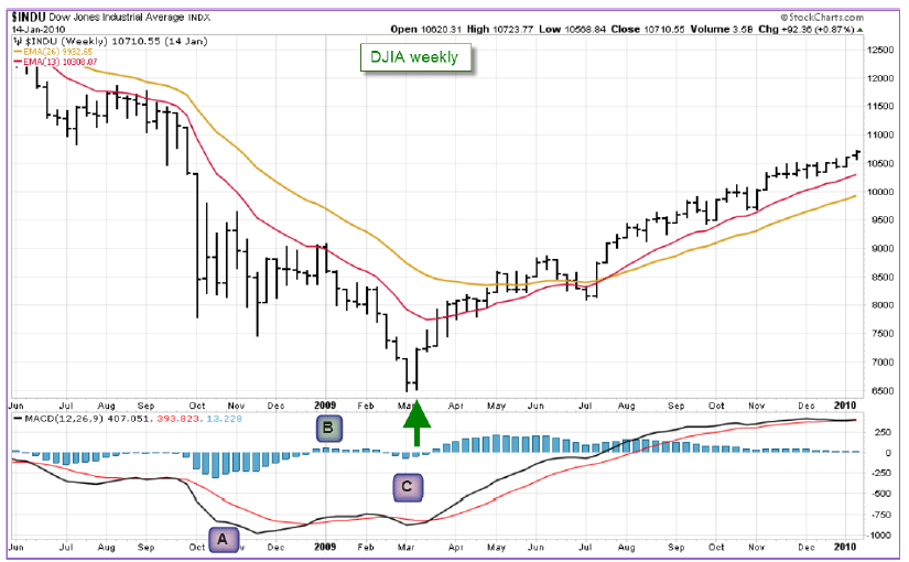
The weekly chart of the Dow in Figure 15 helped me catch the bottom of the 2007-2009 bear market. Bears slammed the market down in area A, but had their back broken when MACD-H rallied above zero in area B. Prices fell to a new low in area C, but the shallowness of MACD-H showed that bears were exhausted. When MACD-Histogram ticked up in area C, it completed a bullish divergence. That buy signal occurred during the first week of a new bull market.
Notice that breaking of the centerline between two indicator bottoms is a must for a true divergence. MACD-Histogram has to cross above the zero line before sinking to its second bottom. If there is no crossover, there is no divergence.
Another key point: MACD-Histogram gives a buy signal when it ticks up from the second bottom. There is no need to wait until it crosses above the centerline for the second time. The buy signal occurs when MACD-Histogram, still below zero, stops declining and traces out a bar that is less negative than its preceding bar.
To quote again from Two Roads Diverged: “Bearish divergences occur near market tops, where they identify dangerous cracks in seemingly happy uptrends. A bearish divergence occurs when prices rise to a new high, decline, then rise to a higher peak. MACD-Histogram gives the first sign of trouble when it breaks below its zero line during the decline from its first peak. When prices reach a higher high, MACD-Histogram rises to a much lower high. It shows that bulls are weaker, prices are rising simply out of inertia and are ready to reverse.”
Tripadvisor (TRIP) is a prominent company of ‘the new economy.’ I like its website, use it when I travel, and monitor its stock. In 2014 it capped its wild rally with a bearish divergence which warned of a coming downturn. MACD-Histogram rallied to a new high in area “A”, broke the back of the bull in area “B”, and delivered a feeble rally, smaller than “A” in area “C”, even as prices rallied here. The downtick of MACD-Histogram in area “C” completed a bearish divergence and sent a signal to sell and sell short. It gave a very timely signal to sell and sell short before a vicious decline.
Remember: MACD-Histogram has to re-cross its zero line between the two tops and then tick down from its second, lower peak. No matter how tempted you may feel to sell short, sit on your hands until MACD-Histogram has given you its signal. Patience is essential for successful trading. Don’t let the excitement of the game cloud your mind and jump in prematurely.
Later in this book we’ll return to MACD when we discuss the Impulse system. I will also show you one of my favorite trading methods which I call FB+BD – a combination of a false breakout (discussed in a previous chapter) with a bullish or bearish divergence.


