Computerized technical analysis is more objective than classical charting. When an indicator is up, it’s up, and when it’s down, it’s down. There’s no fiddling with the angle of a ruler.
Technical analysis software contains a wealth of indicators, but you aren’t going to use all of them. Compare this to sitting down in a restaurant and picking up a menu. You’re not going to order every item on the list, only select an appetizer, a main course, and a dessert. In trading, we need to select just a handful of indicators and learn to use them.
A perfect indicator doesn’t exist. Markets are complex; you cannot win using a single tool. Some indicators work best during trends, others in trading ranges. Trends and ranges are easy to recognize in the middle of a chart, but the closer we get to the right edge, the foggier they become. That’s why we need to combine trend-following indicators, which are good for trends, with oscillators, which work better in trading ranges. Let’s begin by selecting several indicators, and in later chapters we’ll combine them into trading systems.
Maximize your profit by copy Our Trade
In selecting indicators, you may begin using what I show you here but please feel perfectly free to choose others. Just remember to keep their number down to five or, at a maximum six. That’s more than enough; using more will only create confusion. I call this approach ‘Five bullets to a clip.’
The first tool I like to add to every chart is a pair of moving averages.
Before using any indicator we must understand how it is constructed and what it measures.
Each tick on your computer screen reflects a transaction between a buyer and a seller – a momentary consensus of value. Buyers bid low, sellers ask for more, but they feel pressure to act before some undecided trader steps in and snatches away that deal. When a buyer and a seller step forward from the crowd and trade with each other, a price tick appears on your screen. The consensus of value it represents keeps changing with every new tick, and those ticks coalesce into bars or candles.
Moving averages add up prices during a selected time window and average them out. If each tick is a snapshot of value, then a moving average is a composite photograph of value, a trend-following indicator.
I highly recommend using exponential moving averages (EMAs) rather than simple ones. EMAs are more sensitive to changes but they don’t react to the dropping off of old prices like simple averages.
The main message of any EMA is the direction of its slope. It rises when the crowd trading a stock grows more optimistic – bullish. It declines when that crowd grows more pessimistic – bearish.
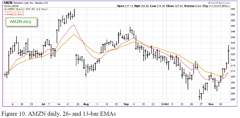
A fast EMA (which I like coloring red on my chart) reflects a shorter-term consensus of value. A slow EMA (colored gold) reflects a longer-term consensus of value. I always use a pair of EMAs, with the time window of the slow EMA twice as long as the fast EMA. My pairs may be 13 and 26 or 11 and 22 bars, etc. The bars can be weekly, daily or intraday.
Maximize your profit by copy Our Trade
To add these two EMAs to your chart, follow these steps:
1.) Find the “Overlays” area located below the chart
2.) Select “Exp. Moving Avg” from one of the overlay dropdowns in that section. We’ll create the gold, 26-period EMA line first.
3.) Change the corresponding “Parameter” setting from the default (20) to “26”
4.) Change the corresponding “Style” setting from “Auto” to “Solid (Thick)”
5.) Change the corresponding “Color” setting from “Auto” to “Gold”
6.) Now, on the next line, select “Exp. Moving Avg” again from the overlay dropdown
7.) Change the “Parameter” from 20 to “13”
8.) Set the “Style” to “Solid (Thin)” and then set the color to “Red”
9.) Press the “Update” button
The zone between the two EMAs is extremely important – I call it THE VALUE ZONE. A swing trader aims to buy below value and sell above it – or sell short above and cover below value.
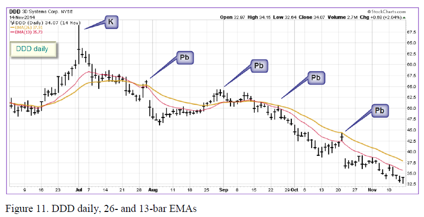
Stocks go down twice as fast as they rise. Professional traders love shorting – betting on price declines. Here you see a bearish trend in 3D Systems, Inc. (DDD), identified by the downsloping EMAs.
The bar marked “K” shows a pattern called a “KANGAROO TAIL” – an extremely tall bar protruding from a tight weave of prices, which typically augurs in trend reversals. The slow (gold-colored) EMA turns down, indicating a downtrend. While the value of this stock is being destroyed, DDD keeps rallying into its value zone in areas marked “Pb” for pullbacks. They provide excellent shorting opportunities for savvy traders.
Bullish traders do the opposite. When a rising slow moving average identifies an uptrend, they buy pullbacks into the value zone.
Maximize your profit by copy Our Trade